Well, it appears to be time once again for one of my semi-regular articles about BMW design. Like so many things in my life, this wasn’t a burden I particularly wanted or asked for, but instead is something inescapable the universe has foisted upon me because it likes seeing me suffer. As a self-confessed goth you might think suffering is something I enjoy, but that’s not the case. Unless I’m specifically paying for it.
When Lord Reith created the BBC in 1922, his intention for the broadcaster was that it should ‘inform, educate and entertain’ the public. David insists on something similar here at the Autopian. We have an editorial directive to adhere to the ‘3 E’s’. Educate, entertain, and I forget the third one. Embiggen or something. Before you change the channel, I’m not going to be writing another two-thousand-word discussion on the current direction of BMW design and the context around it. I’ve done that ad infinitum, and I’m so very, very tired. This past week BMW launched the next (G50) generation of its heartland 3 Series, and it presents me with a copper-bottomed excuse to talk about one of the fundamental building blocks of good car design – nailing the proportions. By comparing the new 3 Series to its superficially similar sibling, the EV i3, in side view, I can hopefully help you understand why some cars look right, and others don’t.
First of all, let’s set out some definitions. Saying ‘the side view’ is pretty self-explanatory, but you should understand exactly what these are and how they are used. When getting their initial ideas down on paper, designers will usually start with a quick side view sketch, because it’s the largest surface of the car and anchors the whole design. Concept artist Daniel Simon told me, ‘Once you nail the side view, that’s half the rent paid.’ In other words, you have to understand exactly what the side of your vehicle looks like before you can think about the front and rear. There are specific spatial relationships between the various parts of a car that subtly alter depending on what category it sits in, which we will get into, but creating a good side view is the starting point for any design.
The issue with side views is that they are quite static and boring. They’re not great at selling an idea to design managers for approval to take to the next stage, and they don’t show the whole of your design because you are looking at only one side of the vehicle in isolation. I’ve probably mentioned it before, but it’s a story worth retelling: the father of modern car design, Harley Earl, could not draw. He had little to no understanding of how to create a form in three dimensions, so he insisted his designers present their ideas in orthogonal plan drawings – that is, separate front, rear and side views – before allowing any modeling to commence. What this meant in practice was all of Earl’s cars (basically GM’s entire output from the mid-thirties to about 1958) had very little consideration for wrapping the design of the front and rear around into the side profile. Earl’s replacement, the equally hard-drinking and sweary Bill Mitchell, was a trained illustrator, having got his start working in advertising on Madison Avenue. Mitchell intrinsically knew that to really understand a car’s design, you needed to view the whole thing (as much as was possible in a sketch or rendering) rather than each side in isolation. Which is why, as designers, once we’ve got a side view we’re happy with, nearly all the sketch development is done in flat-perspective front and rear three-quarter views. This way we can properly work out how headlights wrap around onto the fender, for instance, or how the line of the hood might change direction as it meets the front of the car. Basically, side views are great as a tool for starting and evaluating a design, but not always helpful in selling or developing a design, at least in the early creative stages when it’s all still on paper or on a screen.
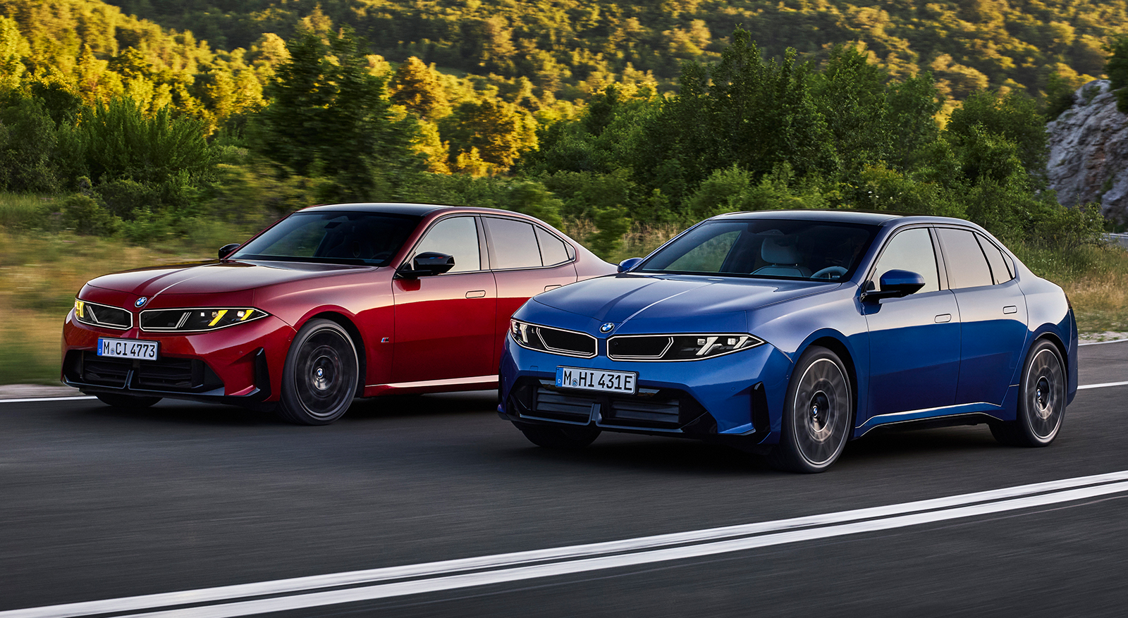
The second issue is that zero-perspective side views are not very flattering. When you look at a car in real life with your own eyeballs, perspective enhances shapes and hides overhangs. This is simply the physics of light and biology in action – and one of the reasons designers work on full-size models. Creating a zero-perspective side view, whether it’s done digitally in rendering software like VRED or by taking a photograph (using a long lens zoomed in from a distance), flattens the car and brings the overhangs into sharp relief – so to the untrained eye they can look gawky. Bear all this in mind as we look at some side views to make some comparisons between the two new BMWs.
The other definition to get your noodle around is what on earth am I blathering on about when I say proportions. If you think about the side view of a car – in this case, a three-box, rear-wheel-drive sedan – those three boxes are the hood, passenger cabin, and the trunk. In car designer speak, these boxes are known as volumes. This is why a vehicle that is all passenger cabin with no separate hood or trunk, like a minivan, is called a monovolume. When you have more than one ‘volume,’ the relationship between each one, and the wheels and wheelbase, is known as the proportions. Now this might all sound a bit subjective, but the thinking behind vehicle proportions is all about visual balance. Do all these constituent parts – wheels, hood, roofline, trunk, and overhangs come together in a way that looks cohesive and without any one element overwhelming the others? Do the wheels look like they are in the correct position, and does this vehicle sit on its wheels so that it looks balanced, or is it nose- or tail-heavy? Is the side view harmonious in a way that is appropriate for the segment of vehicle we are designing?
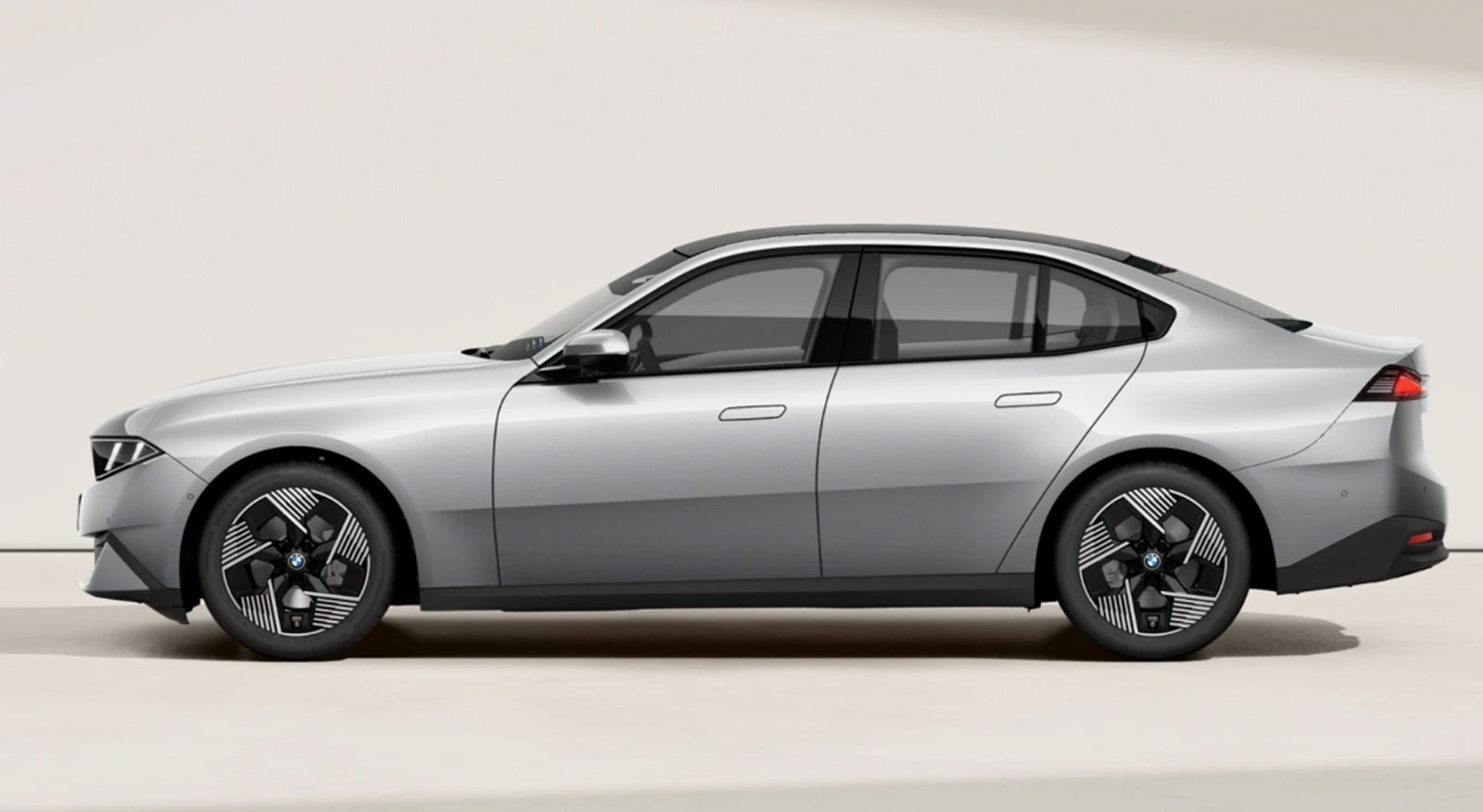
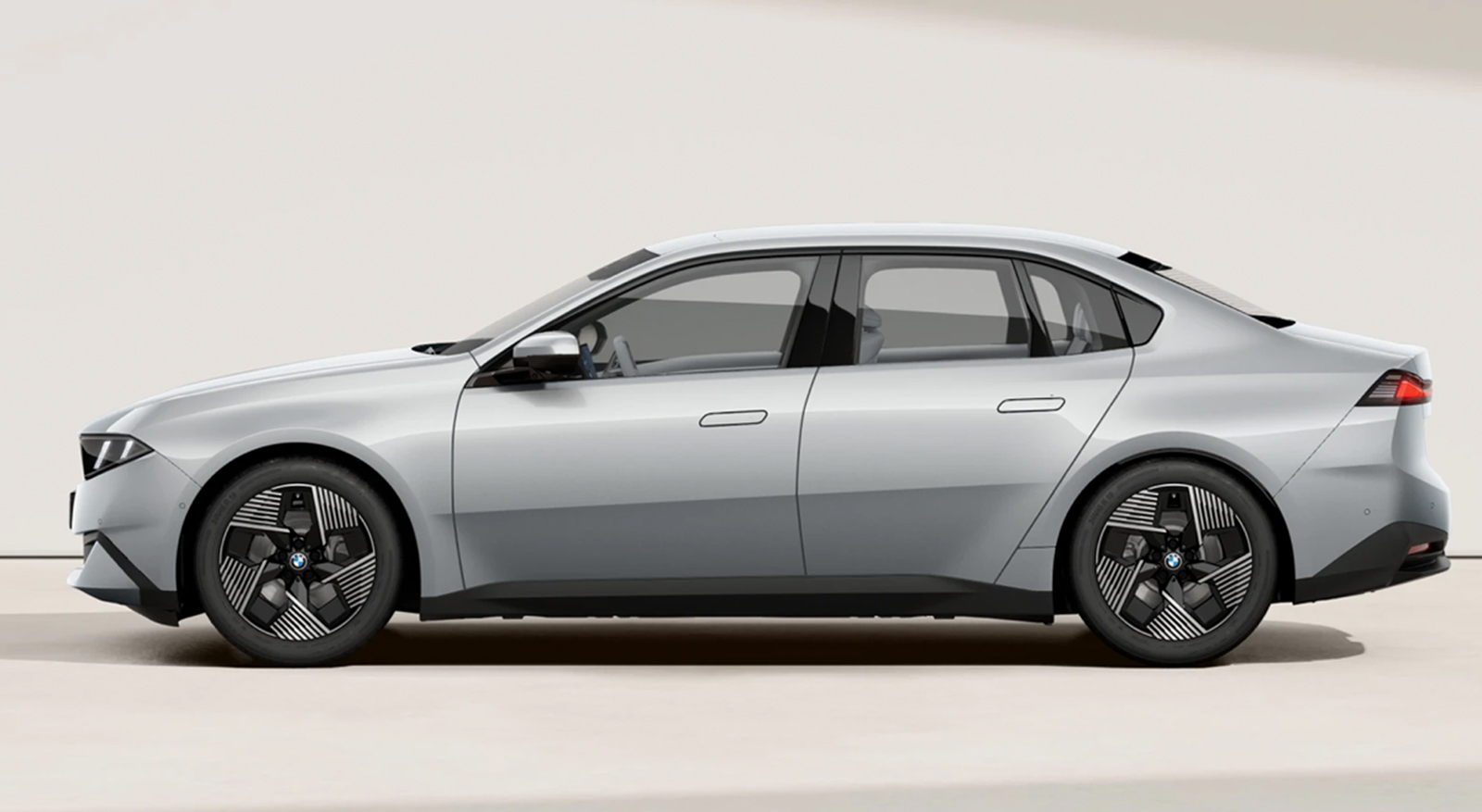
Alright, that’s all the tedious car design theory out of the way. How does all this apply to the new 3 Series and i3, and why should we care? The interesting thing to me is that this is the first time I can think of (feel free to chime in the comments) that an OEM has tried to put an identical body on two different platforms in an effort to convince customers it’s the same car. I’m not talking about similar lights or grilles or other visual DNA that’s been copied and pasted to create a family resemblance. What BMW is attempting is much more involved than that. It’s more akin to releasing a film on VHS and Blu-Ray. At first glance, the same to look at, but under the surface, different things with a very different visual result. And we can use side views to decode exactly what is going on, and why the CLAR-based ICE G50 3 series looks terrific, and the Neue Klasse-based EV i3 version less so. Fortunately, we have a very simple way of initially figuring it out by using the wheels to guide us.
For the purposes of this piece, I’m going to stick to the three-box sedan category of car, since that’s what we are talking about. Using the wheels to guide your overall proportions is universal across other categories of cars as well. For a EuroNCAP/Global D-class sedan (in the EPA definitions, the 3 Series falls in between Compact and Mid-size), the wheelbase should be about 3 1/3 wheels and body height between 2 and 2 1/4 wheels. Let’s have a look:
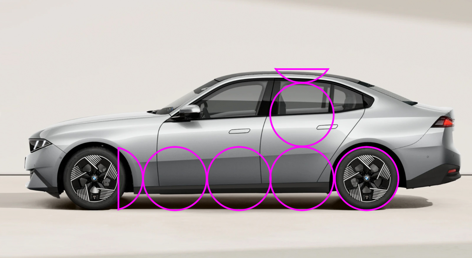
As you can see, the new ICE G50 3 series fits pretty much within these ideals.
… And in case you think this is something I pulled out of my ass, let’s have a look at some older models:
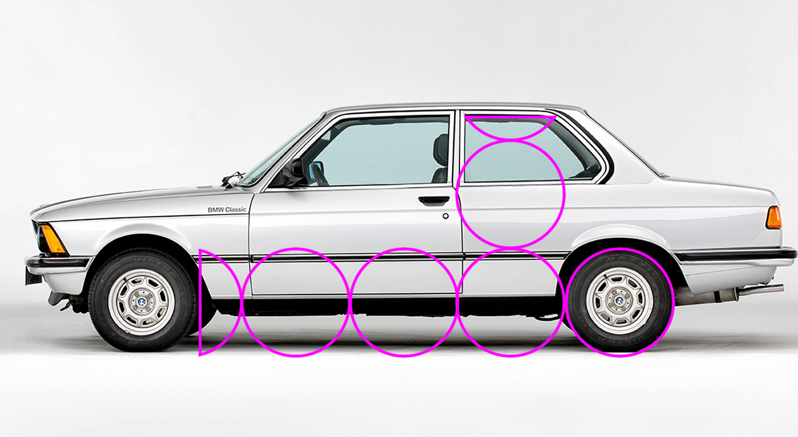
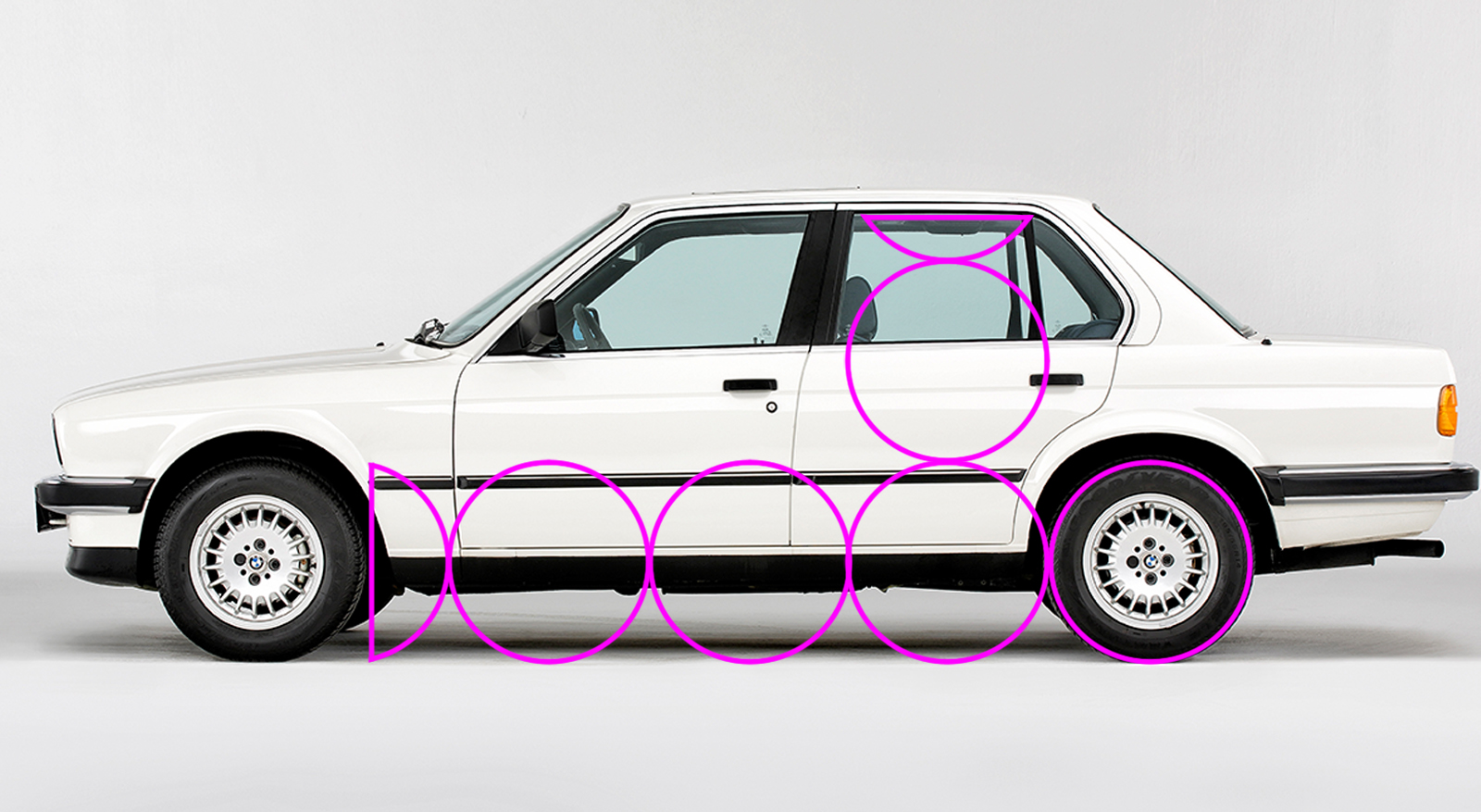
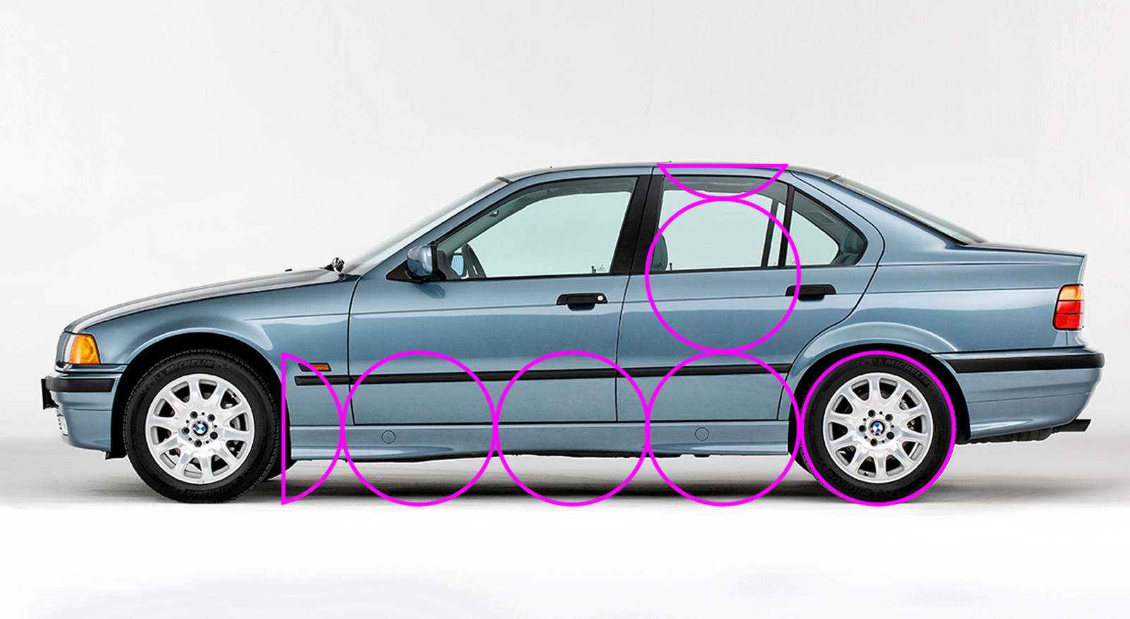
There’s a bit of a drop in cabin height between the E30 and the E36, but as the 3 Series grew slightly, it would have been possible to recline the passenger seating position more, and the car itself is longer overall. With these images, I’ve kept the pink overlay in the same place and at the same size, and then scaled the photos so the rear wheel fits. Like all cars, the 3 Series has grown over the years, but the wheels have also increased in size to match, so the overall proportions remain roughly the same. Let’s have a look at the i3, which is built on a different platform.
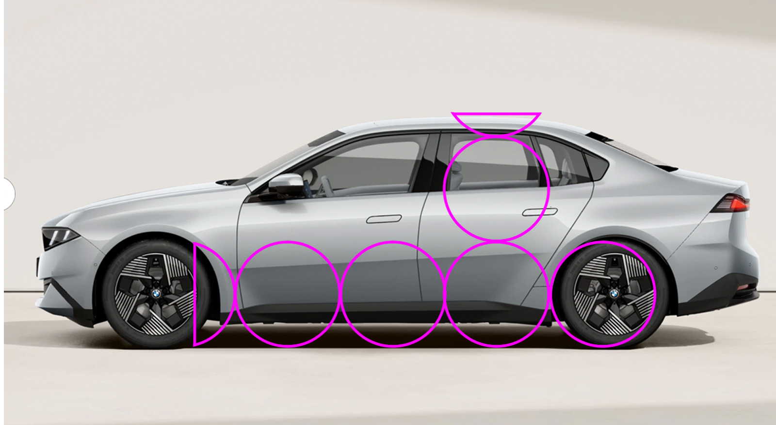
Huh. The wheelbase itself appears correct, but it looks like the wheels are in the wrong place. I’ve scaled the images of the 3 Series and the i3 to the same length, because in real life at 4760mm for the BEV and 4765mm for the ICE, when viewed on a screen, they near as dammit are. Using the wheel guide overlay, you can see the i3 has its total wheelbase pushed back, equalizing the length of the front and rear overhangs and making the whole car look static.
Front axle position is determined by the powertrain layout. Rear-wheel-drive vehicles need more hood length to package a longitudinal engine and gearbox arrangement. This pushes the passenger cabin rearwards, leading to a shorter front overhang and a longer rear one. We can demonstrate this by looking at the relationship between the A pillar and the centerline of the front axle. On a rear-wheel-drive car, if you continue the line of the A pillar, it should continue through or slightly behind the front axle.
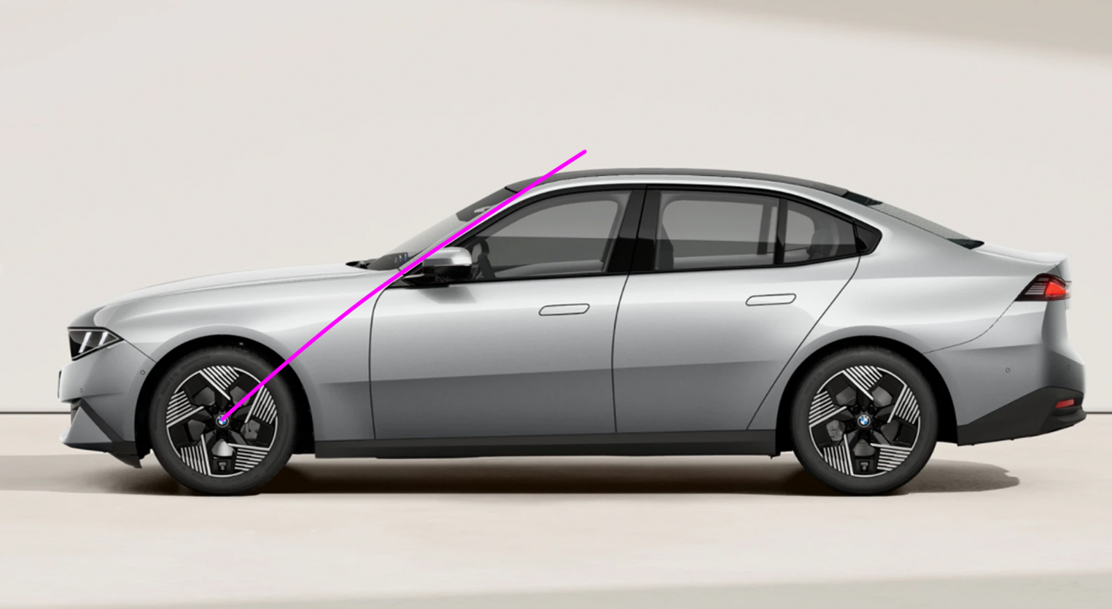
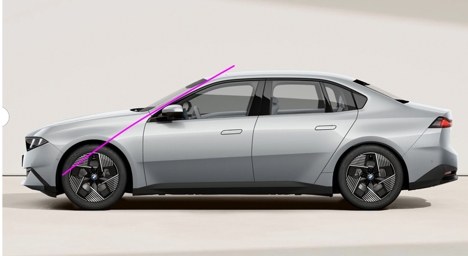
Doing the same thing on the i3 shows the A pillar pointing well in front of the axle centerline. This is more in keeping with the proportions of a front-wheel-drive car, which needs more front overhang to package a transverse powertrain, or a mid-engined car, which has a passenger cabin pushed forwards because everything else is behind it. When you have a longer front overhang, you need a shorter rear one to keep the visual weight more within the wheelbase and help maintain a sense of movement. The thing to understand about all this is not that RWD cars automatically have better proportions than FWD cars, or that there is some overall ideal proportion and any car that doesn’t fit that template is automatically a poor design. It’s all about nuance and what is appropriate for the car in question. There are plenty of horribly proportioned sedans and terrific-looking hatchbacks. When I dissected the design of the EV Ford ‘Capri’ two years ago, my main criticism was that its height was out of proportion compared to its length, and the A-pillars were too far forward. I’d be on thin ice (ha!) levelling the same height argument at the i3 because it’s only 25mm (1”) taller than the 3 Series. Of the two BMWs, the i3 actually has a 37mm (1.5”) longer wheelbase, so in theory it should have plenty of scope for pushing the front wheels forward – but this extra length disappears because the i3 rolls on 1” bigger rims. Let’s try that A-pillar and wheel overlay exercise on a 3-series competitor, the Audi A5:
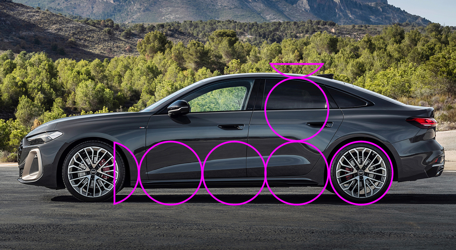
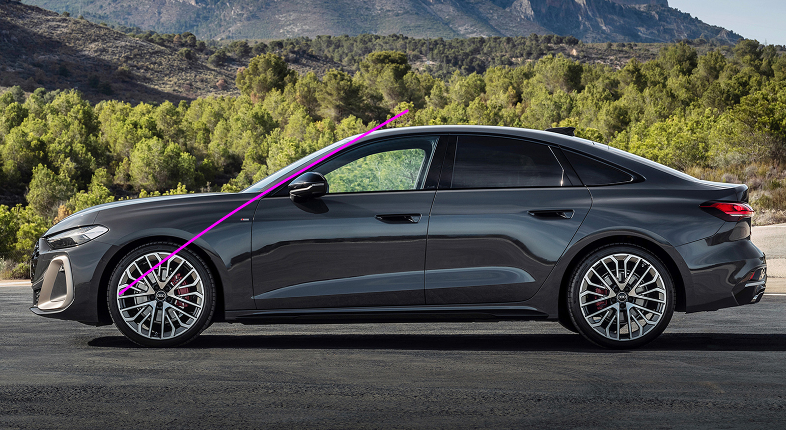
You can see the proportions are correct, and even though it has a shorter hood and the A-pillar points ahead of the front axle, I think this is a very nicely proportioned side view indeed. So it is possible to make a good-looking FWD sporting sedan – my star witness in this argument is the Alfa Romeo 156 or the first-generation Peugeot 406. Closer to home, the Chrysler LHS cars and Oldsmobile Aurora look brilliant. For all its head-munching faults, the Cadillac STS was admired by none other than Bruno Sacco. So that alone is not the issue. And the i3 is not FWD – the launch cars are all AWD.
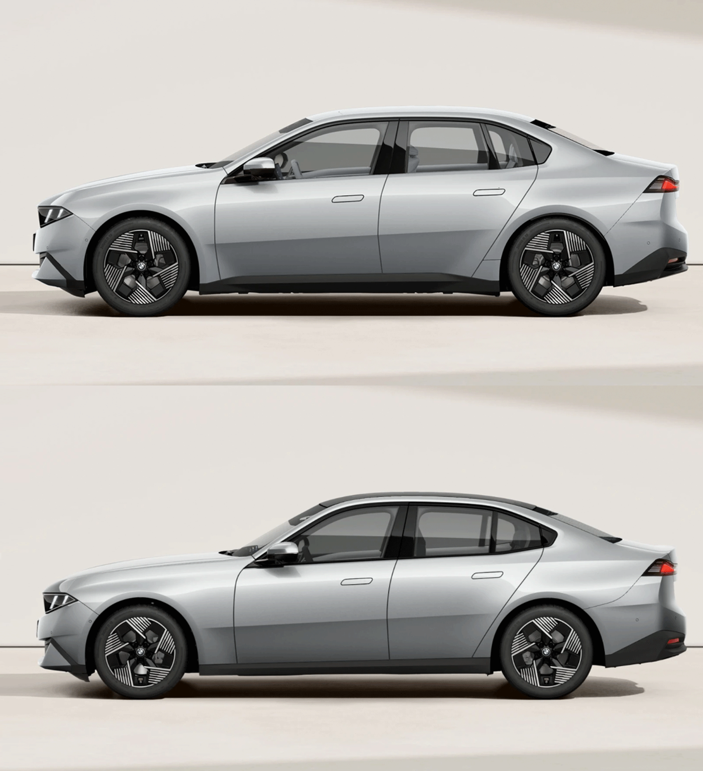
With its nearly equal overhangs and misplaced A-pillars, the i3 is neither fish nor fowl. It doesn’t commit to a proper cab-forward layout because that would move it too far away from the 3 Series. But neither does it match the lithe athleticism of the ICE car, because the front overhang is too long and the hood too short, because the base of the windshield is a long way forward. Normally you do this on a FWD car to make the most of the available length to liberate room for passengers. But in the press pack BMW makes no mention of interior dimensions whatsoever, so until the media gets its grubby hands on the new cars we won’t really know what they’ve achieved with the interior space.
Although modern platforms are more like a kit of parts and systems than just being a sheet metal foundation to build on, there are sometimes hard points that cannot be altered. My suspicion is that the firewall-to-front-axle distance on the Neue Klasse platform is one of them, and that is what has lumbered the i3 with shitty proportions. The same Neue Klasse platform also underpins the iX3 EV SUV, but the shorter dash-to-axle doesn’t matter on that car because it’s a two-box SUV, not a sporting sedan. As ol’ Martini Mitchell himself understood, the dumpiness of the i3 is a consequence of not taking a step back and viewing the car as a whole, and in this case that includes the thinking behind it.
All images BMW unless otherwise stated.
The post Why Do Some Cars Look Wrong? Our Professional Car Designer Compares The New BMW 3-Series And Its i3 Sibling Side By Side appeared first on The Autopian.