Generally, I’m quiet fond of most 1970s design, even the stuff that looks especially dated and hilarious to us now. Maybe especially that stuff. But there is a subset of 1970s design that always kind of creeps me out. I think most of what I like about ’70s graphic design is that it can (not always, but the potential is there) become a sort of zanier take on Bauhaus/Modernist design, with earthtone stripes and clean typography and a certain strange futurist feeling. But every now and then, designers in the ’70s would give in to these weird urges to make things absurdly fussy and ornate, and look to this weird idealized Victorian era for inspiration. And the combination of those things just ends up, well, weird. And a little creepy.
This 1971 brochure for the Winnebago Chieftain is a great example of what I mean; Winnebago design from the 1970s was usually felt more like that ’70s futurist sort of feeling, but this brochure leans hard into that other weird ’70s influence, that strangely saccharine and somehow unsettling Victorian influence that just makes me think of strange lonely old houses and creepy porcelain dolls that rotate their heads slowly to look at you, clearly possessed, and a certain sort of musty, heavy, overly sweet lingering smell.
It weirds me out. I mean, just look at this stuff:

What a I supposed to do with these images? Does this make me want an RV? I mean, only in the context that it could help me get away from whatever this is. That picture of the bed in the upper left feels like a photo the cops would take to show where the hostage was held for all of those months. Then there’s Madame Ghosty in the other upper corner, and that bedroom set out in that field with Primrosetta Hathawayfield taking her mourning dove out of its floating, gilded cage just creeps me out. And that carmel-mustard colored shag rug looks longer than the grass it’s flopped on.

Why were we doing this? Why couldn’t ’70s design keep looking boldly forward? Why were we looking back so hard, just with more orange and burnt umber, inscribing fussy lines on cheap particleboard cabinet veneer, faking marble on the walls and getting way too into making tea?
And that typography up top. Ugh. I have this thing against really fussy script typography, it feels cloying and pretentious and is kind of a visual mess. I especially feel this way when script fonts are used for all-caps text, like this:

Ugh, awful! It’s almost illegible, too. Loopy script types like this can have their place, but they were never meant to be all-caps and used for strings of letters and numbers like this. Who likes this?
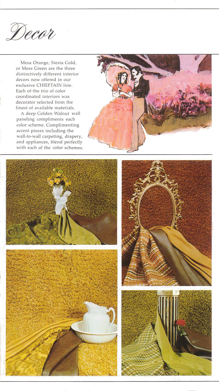
Oof, look at this incredible display of textures and earthtones! Sometimes I forget that a lot of the ’70s was like being in a world made of guacamole and chili and creamed corn. All the fabrics seemed so thick and textured, that I remember. For years I think I thought plaid was as much a tactile experience as a visual one. All of these fabrics feel like everything I touched in the Lutheran church basement youth rooms that hosted the Boy Scout troops I was in.
And, again, up top, we can’t escape this weird backwards-looking fetish. This time it feels more antebellum South than Victorian, though.

The whole pre-Civil War south thing keeps cropping up, too. In this spread about propane tanks and water level gauges, they really needed to sneak in a bit of the Confederate battle flag?
And then sometime they just went full plantation:
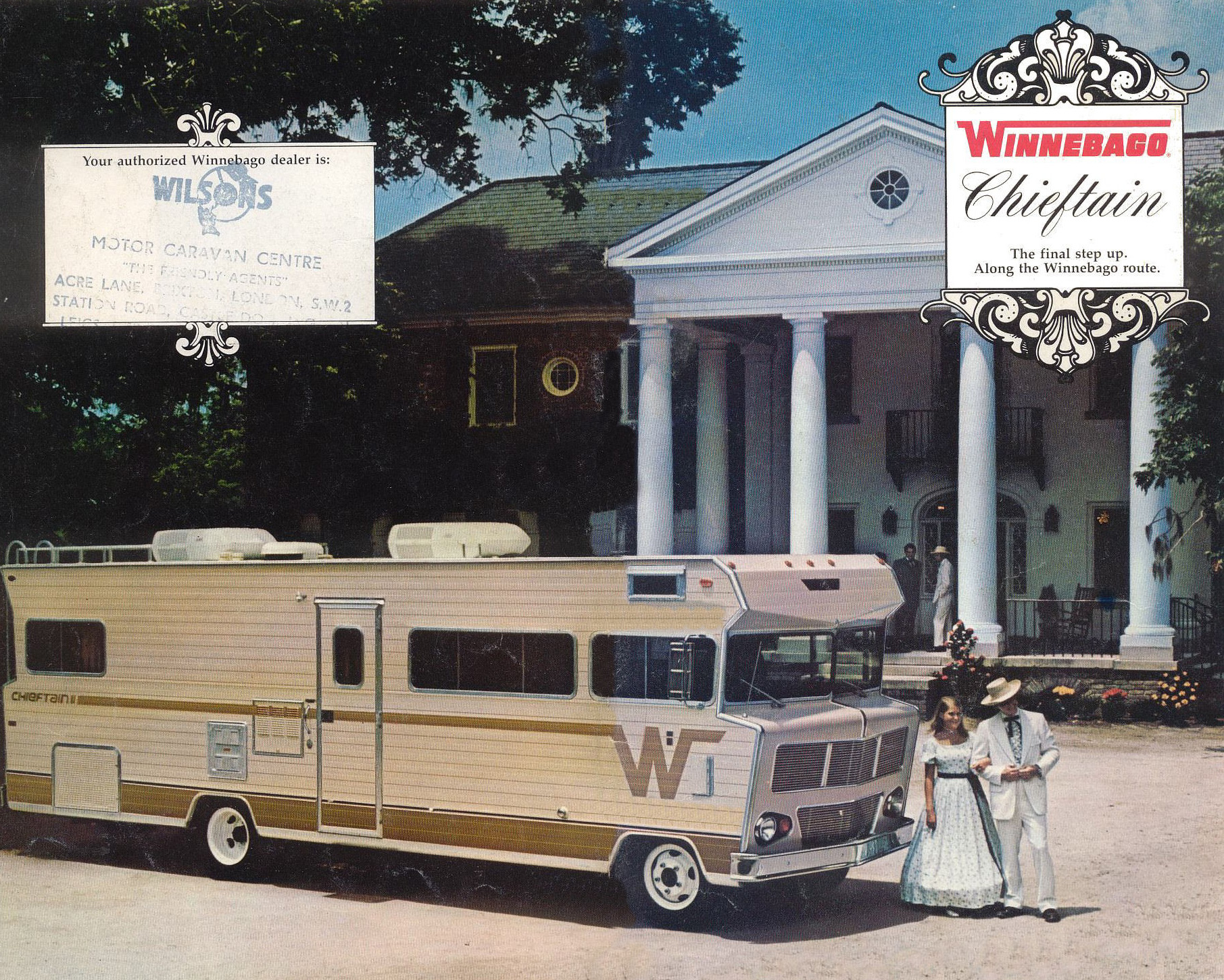
The hell, Winnebago? Why? Why do we need Col.Sanders and his favorite daughter, Herbsann Spices Sanders, promenading in front of this old plantation house to their massive, parked RV? I get that we look at this sort of scene through different eyes today, just seeing a miserable time of oppression, but even back then, why is this a way to sell RVs? I just don’t get the connection here?
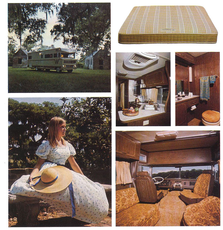
Of course, what could be better to show than a bare RV mattress? Give that some stains, chuck it by a ravine in the woods, and stick a tattered stack of Oui and Swank and Hustler magazines and you have a really powerful scene of woodland discovery for so many people of my generation.
Also, please note the shag toilet seat cover and all those patterned, brocaded fabrics that made every seat look like it had a skin condition.
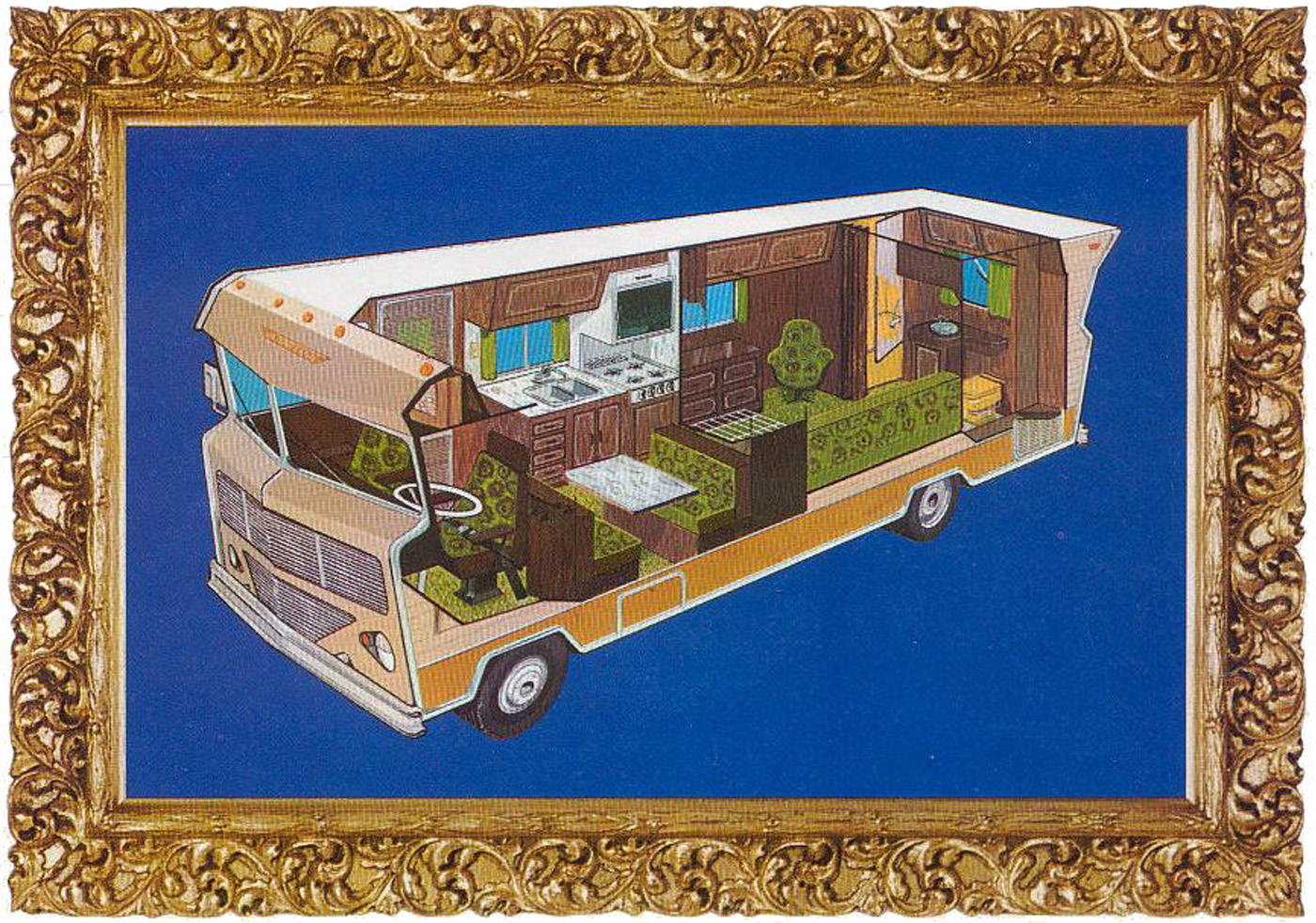
I like how the fabric patterns are shown in this cutaway, because it makes those chairs look like weird aliens. Especially that one near the back, above the couch.
These cutaways are pretty fantastic, though:
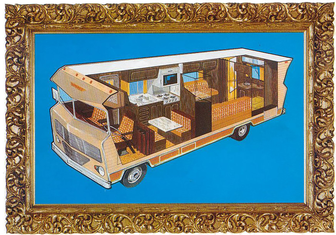
I can’t stay mad at a brochure with such fantastic cutaways! There’s even one free of the absurd ornate frames! Look!

Now that’s a satisfying diagram! These things were so huge, and with their corrugated sides, really built like drivable sheds. I also love their profile/silhouette, which wasn’t just non-aerodynamic, it had a genuine, undisguised contempt for the wind, shoving it aside with real malice as it lumbered down the highway, chugging a gallon of gas every other mile.
Man, the ’70s were weird.
Top graphic and story images: Winnebago
The post This Winnebago Brochure That’s As Old As Me Features My Least Favorite ’70s Design Trope appeared first on The Autopian.